
‘Al Ferma Tempo’
Brand Identity & Design
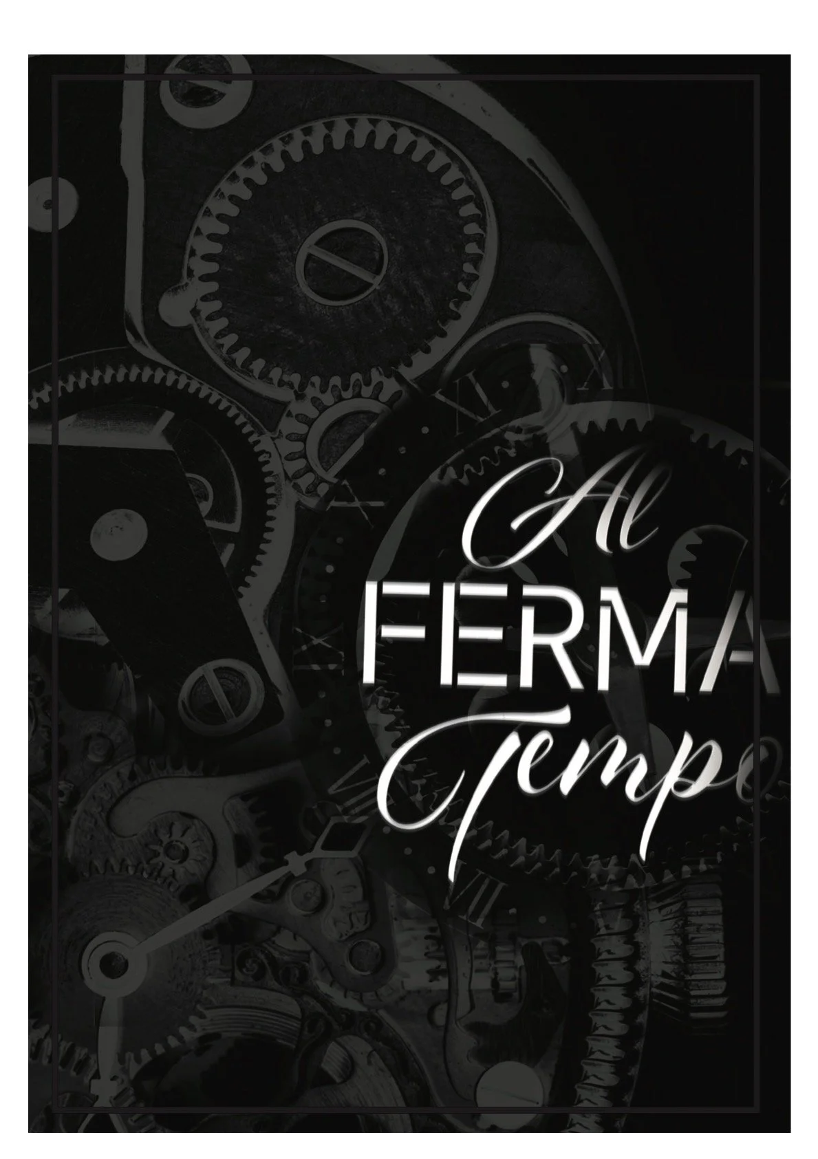
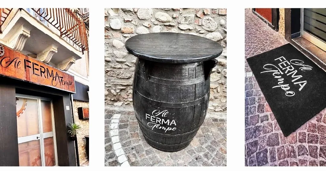
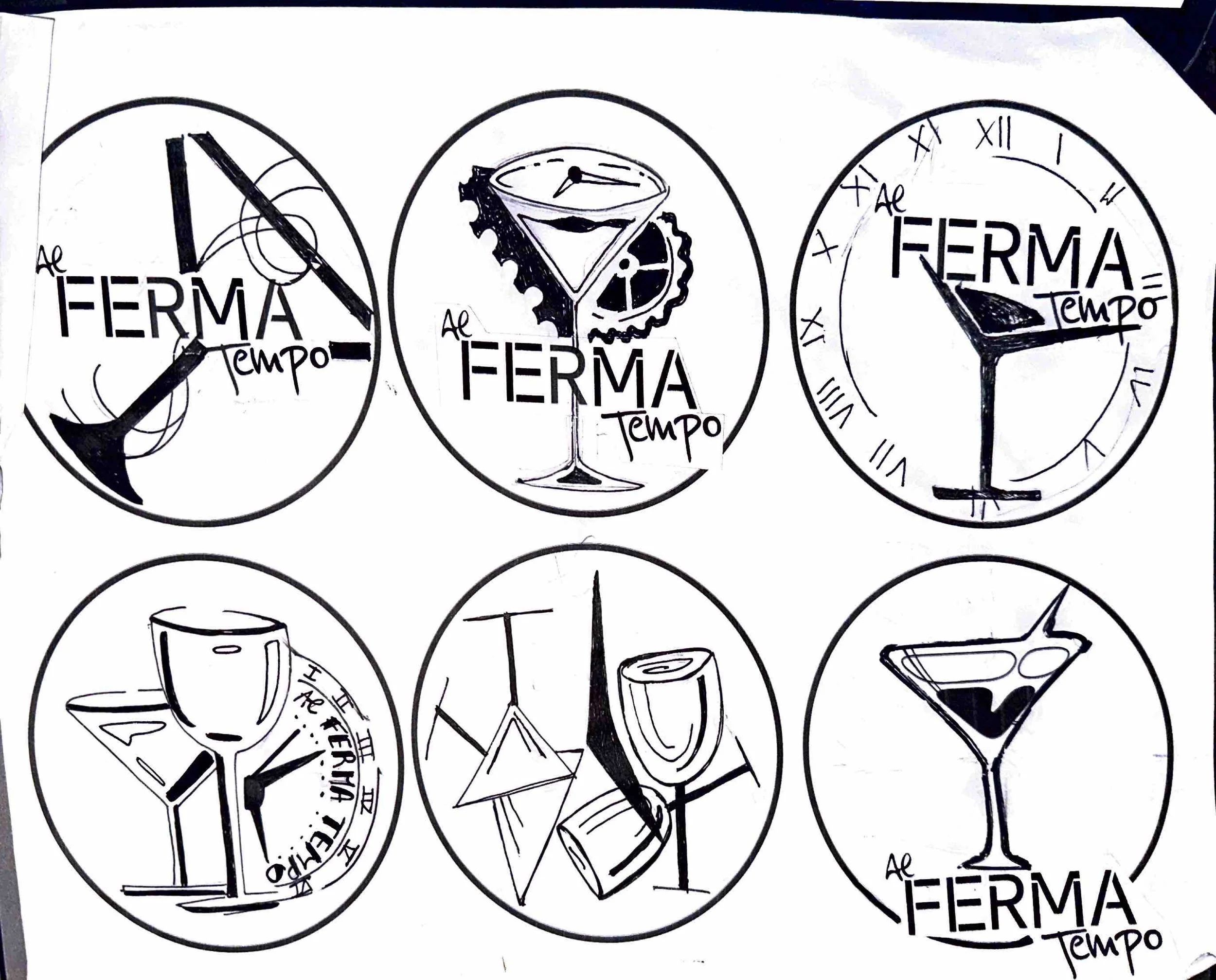
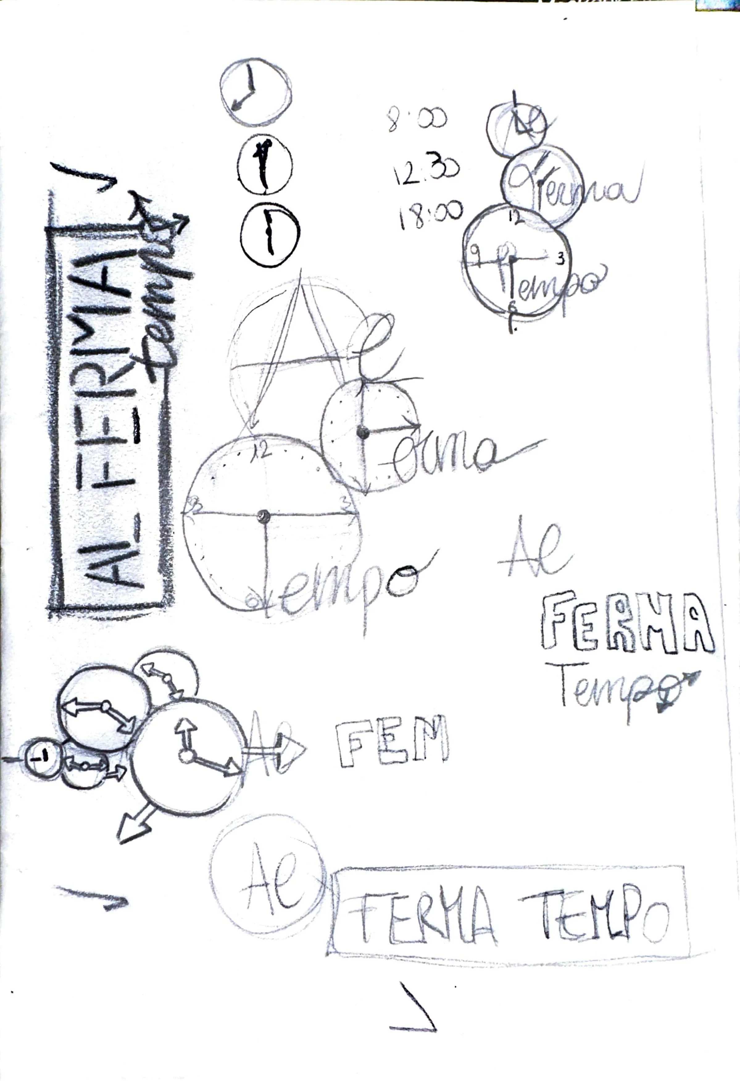
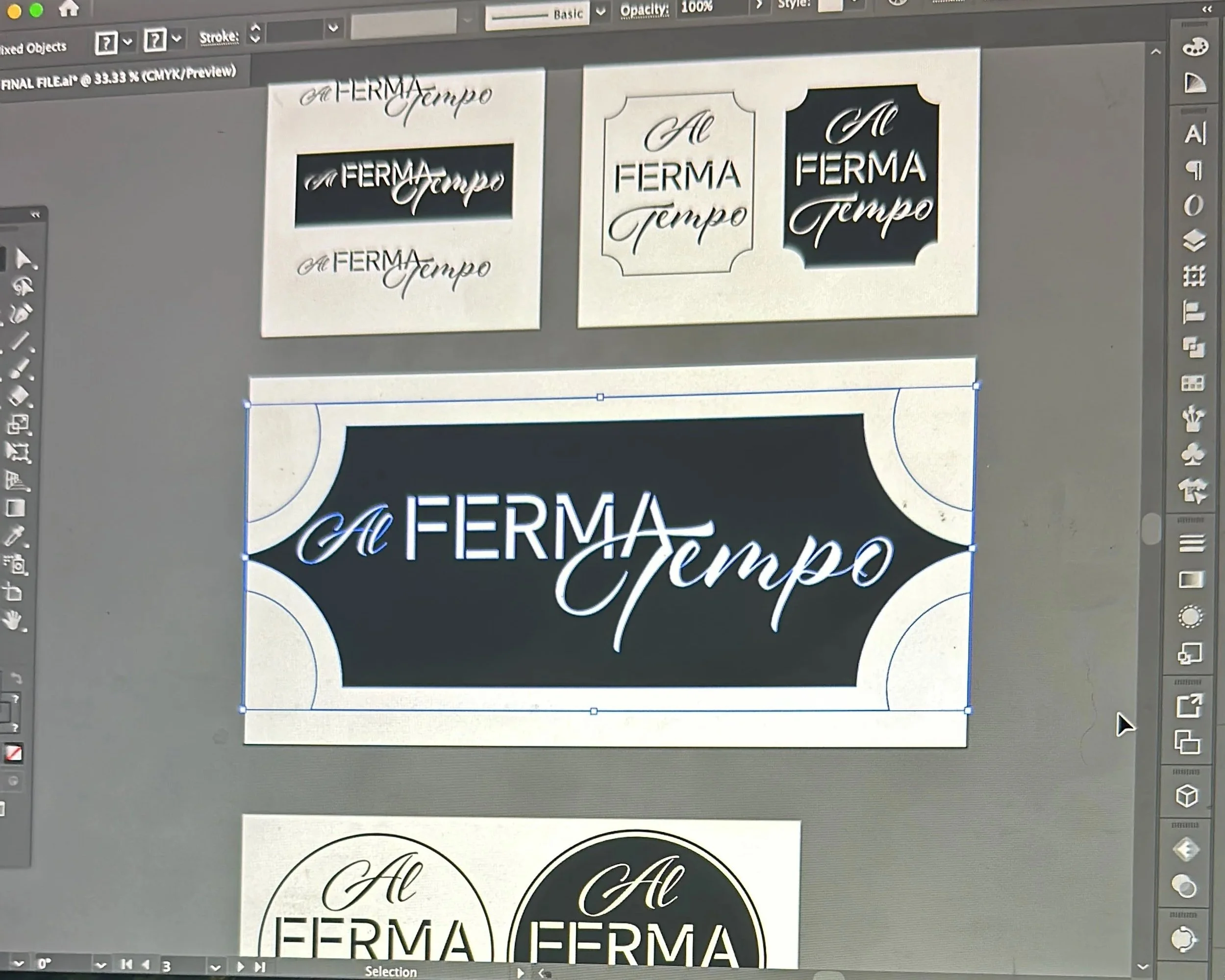
The logo for Al Ferma Tempo was designed to embody the meaning behind the name – “where time stands still.” Its form and typography convey a sense of elegance and pause, reflecting the restaurant’s warm and timeless atmosphere. By combining subtle details with a balanced structure, the logo serves as both a symbol of the brand’s identity and an invitation to slow down and enjoy the experience

“the place where time stands still.”
For the launch of this new Italian restaurant, I developed the full visual identity including signage, logo, and menu design. The concept blends timeless elegance with a welcoming atmosphere, creating a cohesive brand experience that reflects the restaurant’s name –
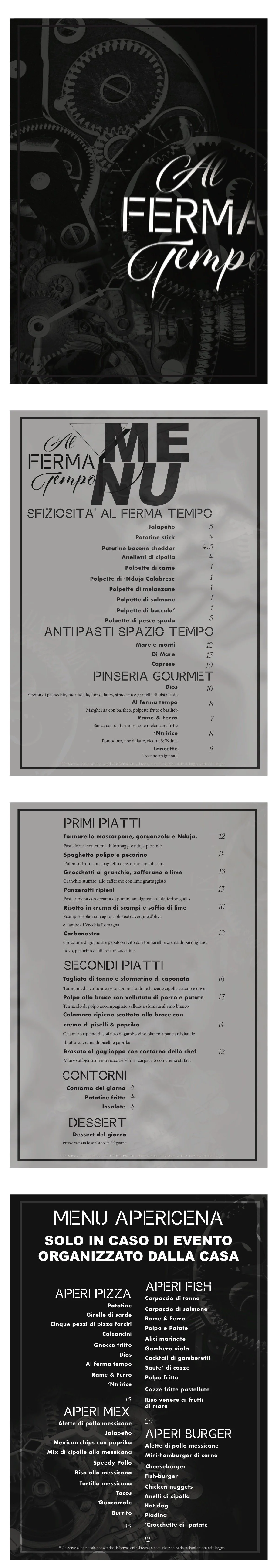
The Menu.

The menu was crafted not only to present the dishes but also to reflect a sense of evolution, guiding guests through the courses in a way that feels natural and progressive. Its design mirrors this flow, creating a dining experience where visuals and taste grow together